
The coldest seasons of the year are beautiful, aren’t they? They remind us of comfort, cosiness at home and give us the feeling of greater warmth.
Knowing that it is probably the best time to transform your home into an even more welcoming environment with the colours of autumn and winter is also quite exciting.
I guess when we think about Autumn, we automatically think about colours. The initial touch to go for is finding inspiration and bet on colours that refer to nature. They are fool proof tricks to provide sensations of warmth and comfort.
So, we decided to give you some tips on how to warm your home with the right decor tones.
Autumn Colours
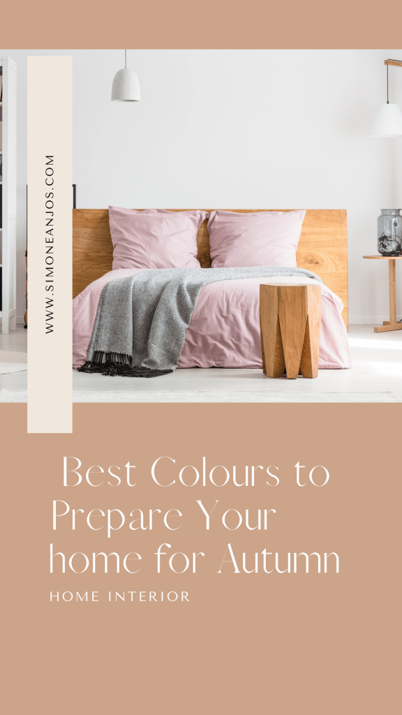
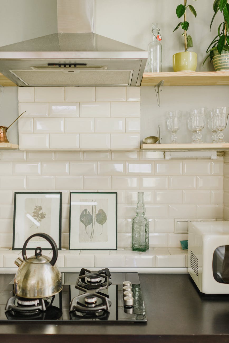
How many shades of brown, orange, and ochre do we see when we look around us in early autumn? Plenty of. And it’s gorgeous. We see the dry leaves lining the floor and the wooden branches gaining space on the horizon of our windows.
The days grow greyer and shorter, and all we want is to be on a cosy couch, with a warm blanket and a cup of coffee in hands. Tea for you, guys.
That’s the reason the predominant colours of the autumn decoration follow the aesthetics of this new cycle that nature shows us. Brown and yellow, earthy, and warm tones are great colours to add a special touch to your home.
The same feeling about grey. As well as cloudy days, the colour makes the environments cosier. They are tones that refer to nature, but in a sophisticated and elegant way.
Warmer Colours
Coldest weathers are all about enjoying warm colourful layers. Intense and striking colors like marsala, navy blue and oil green are sure bets for a living room with a winter look.
The moss green, which reminds the trees in a paler tone, is also a very rich colour for the time. It will certainly make your autumn decor much more stylish.
You can always add a lot of fabrics to your rooms as well, giving the quite elegant and welcoming vibe to the space using blankets, pillows, curtains. All of this will make your corner even warmer and cosier.
Classic Colours
Colder weather is also a perfect time to use basic and times tones. It is possible to keep the elegance and always keeping in style without making extreme changes.
This is the palette where graceful white blends perfectly with camel colour, elegant grey flannel, red and black caviar. Gold and damask rose provide finishing elements that are sure to appeal to all product categories and levels of the market.
Cravings Colours
I love the way we can play with colours and using a more creative way to style spaces. A thought-provoking palette that will tempt the eyes with spicy reds, sweet flamingo oranges, and deep purples.
The neutral flavours of butter rum and cappuccino warm the palette, while the green brings the freshness of the treetops. These tones will draw on sensory experiences to inspire new sensations.


Leave a comment